Money App DEsign
Case Study
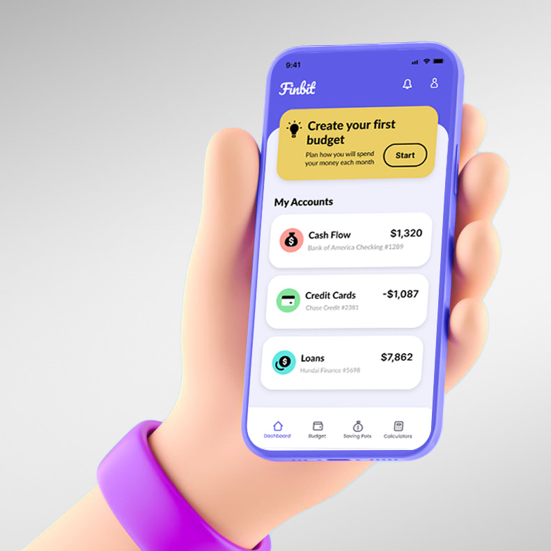
Finbit
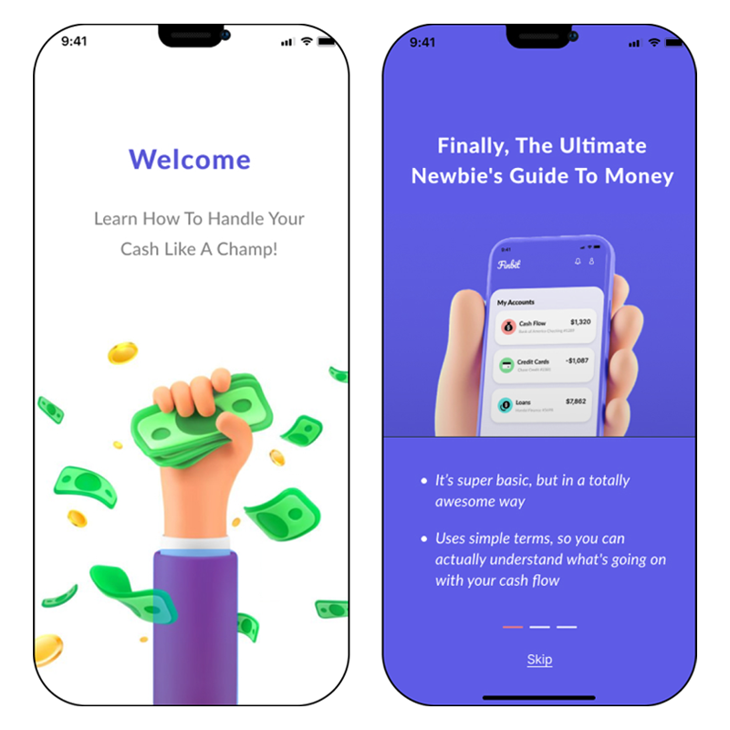
Money app for young adults. Simplified interface & personalized suggestions for first-time money management
My Role
User Research
Wireframing
Usability Testing
Prototyping
Brand Design
UI design
Deliverables
Brand Guide
High Fidelity Flows
Prototypes
Mockups
Tools Used
Figma, InDesign, Photoshop. Illustrator, Miro, Canva
PROBLEM STATEMENT
“ One in five young adult between the age of 18 and 24 have debt in collections ”
Many of them are in that situation because they simply do not understand how money works. Such gaps can result in early financial missteps that follow students throughout their lives.
How can we assist young adults in financially preparing for their future?
Solution
I created Finbit, a money app tailored for young adults. My research guided me to prioritize simplifying money management as the main focus of my app.
Overview
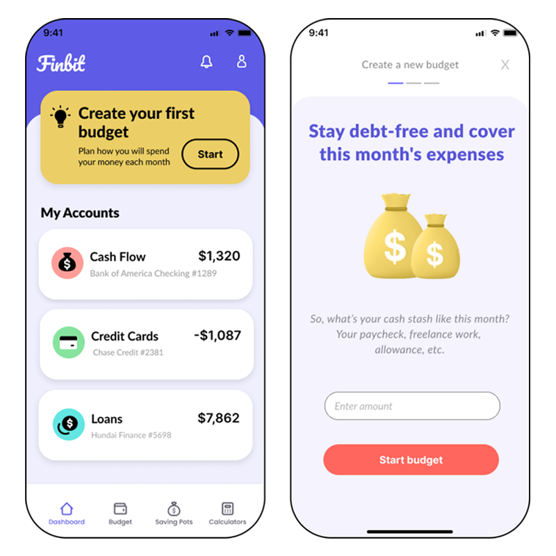
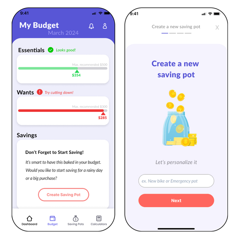
Finbit is perfect for those navigating their first bank account, credit card, and loan. Unlike complex finance apps, Finbit keeps it basic but in a good way, focusing solely on essential features while encouraging saving and budgeting.
“ Overall, it’s giving me a lot of comfort, it’s something that’s helping me manage spending ”
Creative Process
Market Research
Survey
User Interviews
Secondary Research
Competitive Analysis
Heurisitic Analysis
Analysis
Personas
Empathy map
Affinity map
Journey map
Ideate & Design
Sitemap
User Stories
User Flows
Sketching
Wireframes
Prototype & Test
Prototype
Usability Testing
Iterations &
re-testing
Research & Insights
Understanding the Problem
Why is the Lack of Financial Literacy Among Young Adults a Major Concern?
In 2001, more people filed for bankruptcy than graduated from college
While this seems like a dated statistic, over 20 years later, only 15 US states require financial education in high school
The complexity of financial products continues to grow
Young people often do not understand debit and credit cards, mortgages, insurance products, credit reports etc.
Most college students borrow to finance their education
They do so without fully understanding how much debt is appropriate for their education. Many attend college without understanding financial aid, loans, credit & budgeting
Younger generations may not be planning to retire at all
While this doesn’t mean that they don’t desire to save, but 63% struggle to translate their financial knowledge into practical actions
Survey & Interviews Observations
To assess the impact of financial education deficiencies, I conducted a survey involving over 50 high school and college students, and interviewed 5 of these individuals. I didn’t expect some of these numbers, given that half are already in college:
68%
ARE SEEKING HELP WITH BUDGETING AND SAVING
45%
answered wrong on a basic question about credit cards
50%
are in 2nd to 4th year of college
80%
USE A MOBILE APP FOR BANKING
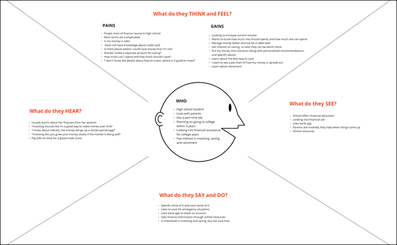
I built an affinity map to organize my observations
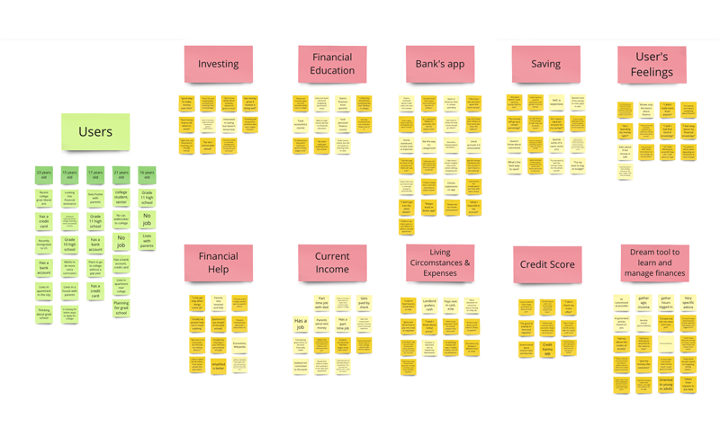
and empathy maps to better understand the users
I learned that there are 3 main resources available to answer their financial questions:
-
- Home: Parents and family
- Online resources: Google, online articles, social media
- School: Some schools offer a personal finance course
Upon further investigation, I discovered certain issues with these resources
Home: Only one third of the parents are well involved in their teens finances. Which leaves nearly two thirds that are somewhat involved or not involved at all
Online resources: They need more specific advice, the information online is vague
“ It’s implying the answer with a lot of words, but it’s not getting to the point in a way that I can understand ”
School Finance Course: It is not enough
“ It was crammed into one semester and as soon as the course was over I forgot most of it ”
“ The program doesn’t do a good enough job of simplifying it, they throw so much at you ”
“ I wish they split the course up and taught me what I needed to know right now, how to navigate finance when I’m in high school vs when I’m an adult, instead of putting all of it at me ”
Personas
To help focus my strategy on specific user groups, I created 2 personas, and each persona represents a big portion of the young adults I am targeting. Instead of focusing on thousands of individuals, this helps me focus on a manageable and memorable cast of characters to design for.
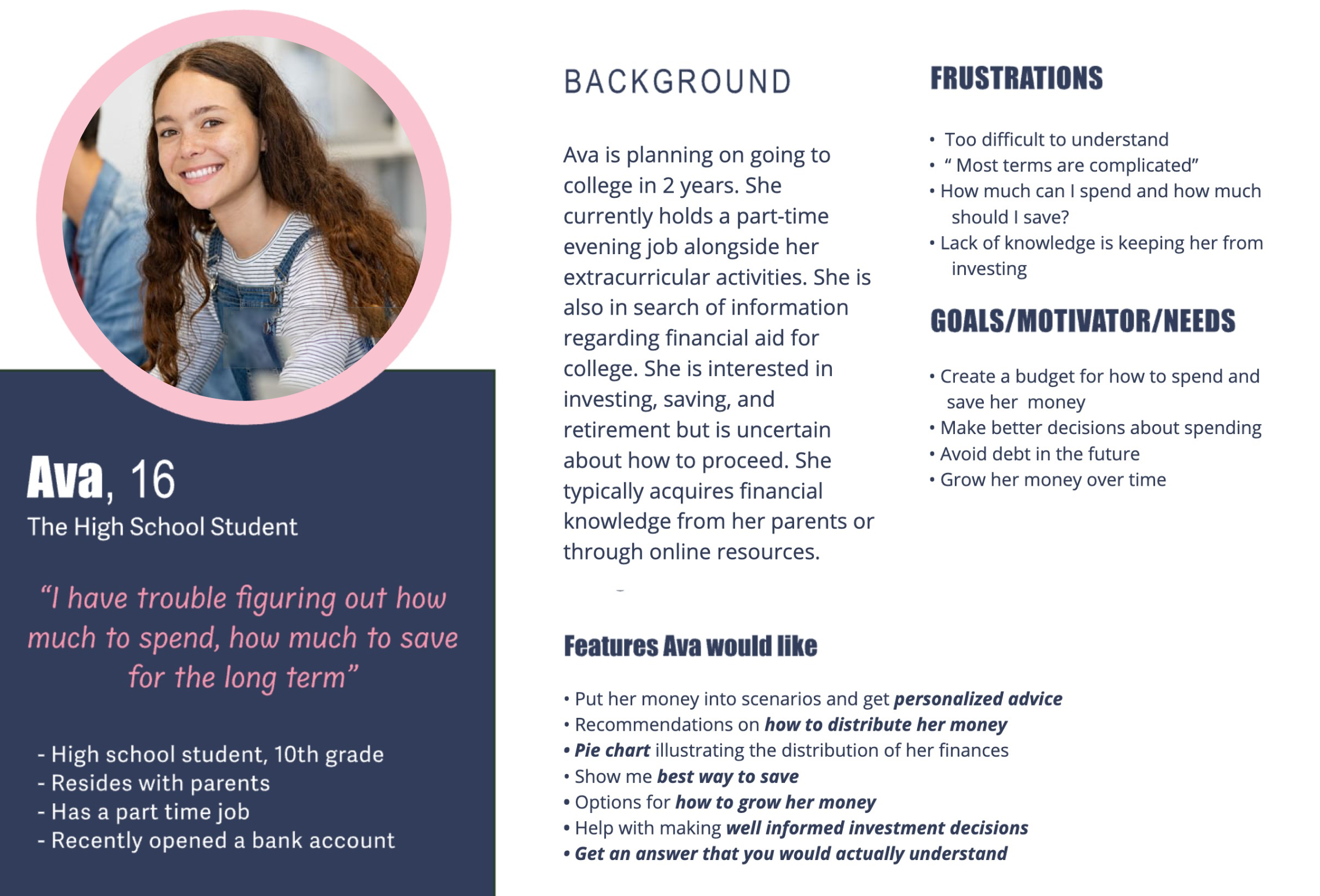
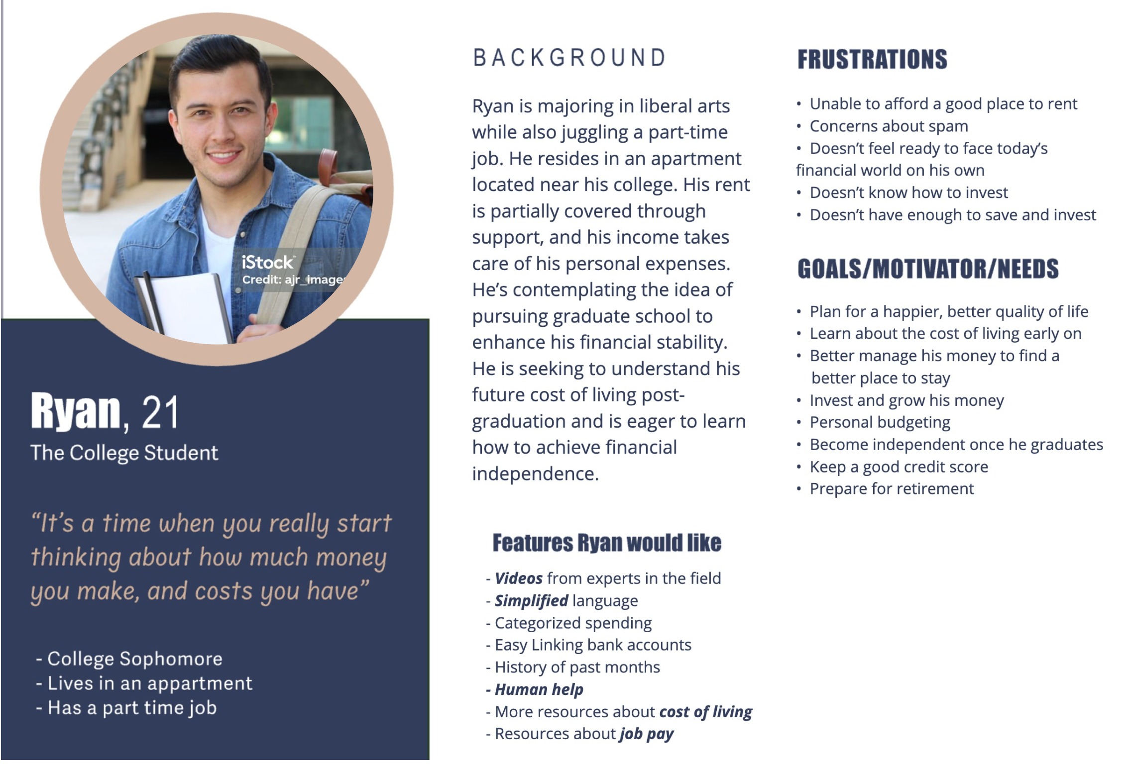
Key Audience Insights
Their Frustrations
- Learning everything about finance is overwhelming
- The information online is too vague
- Finance is becoming too complex
- They want to avoid debt in the future
Their Needs
- Only what they need to know right now
- Personalized advice
- Simplified language
- Help with budgeting
Ideate & Design
Now that I have a clear understanding of my audience and their frustrations, what’s a viable solution to address their needs?
My goal is to educate and empower young adults to make informed financial decisions. I designed & created Finbit, an App tailored for young adults. The main focus of this app is to simplify money management while encouraging saving and budgeting.
Sitemap & Userflows
In order to help me visualize the various pages I’ll need to design for my app, I created a sitemap and user flows.
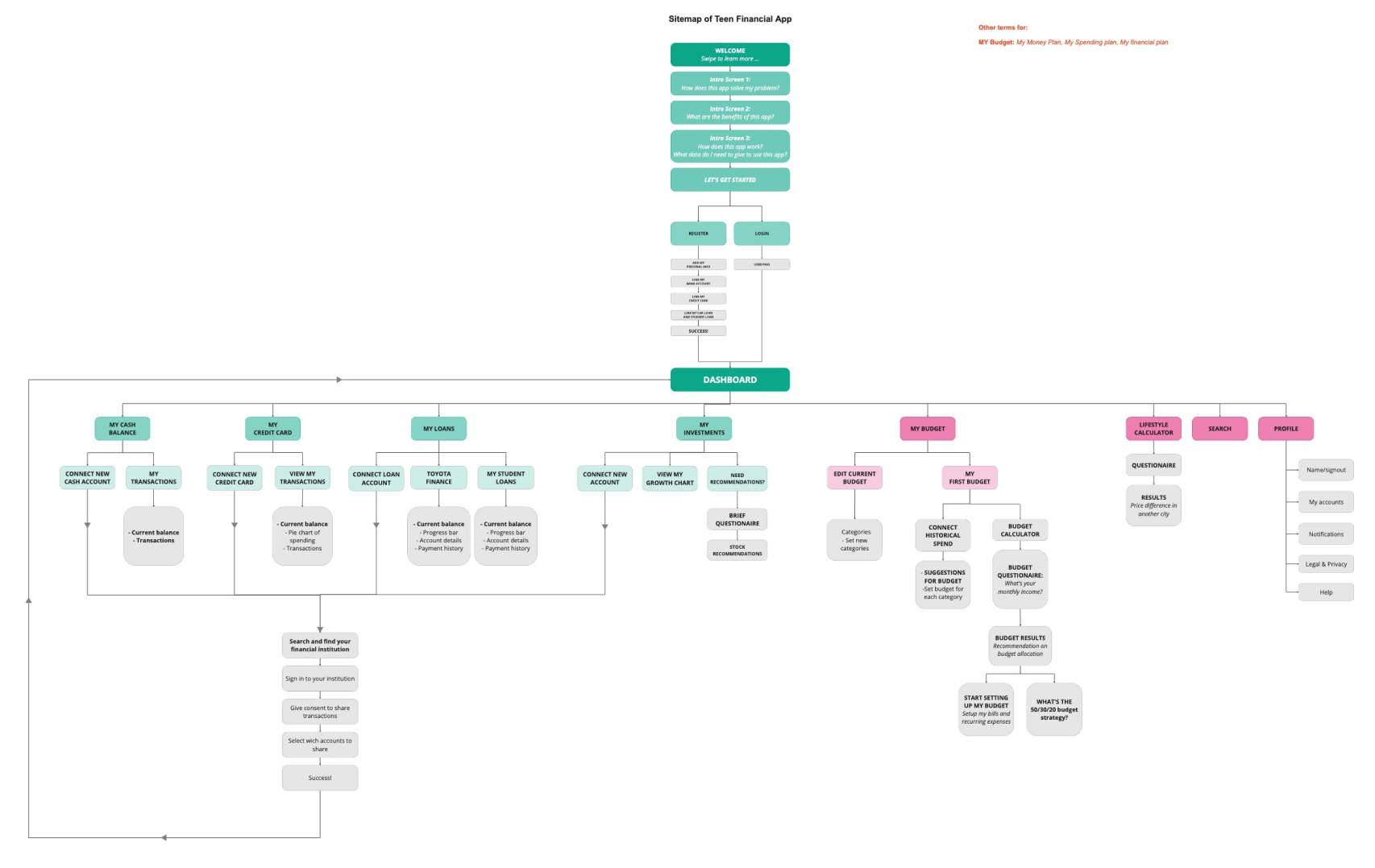
The sitemap helped me to keep track of how users will move throughout the app, and identify spaces in my designs where problems may exist
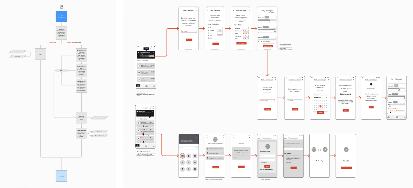
User flows are a visual representation of specific routes that a user might take through the app to achieve a goal
Design Phase
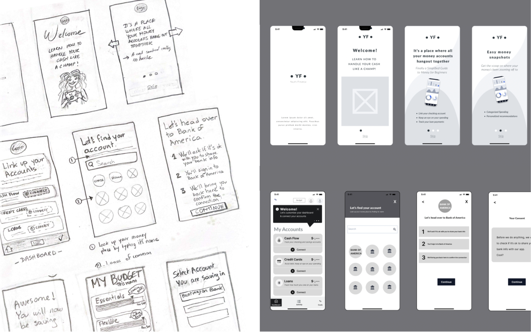
Next, I started bringing my ideas to life. I created low-fidelity hand-drawn sketches and used it to perform guerilla testing. This approach was a quick and cost effective way to get feedback on the early stages of my designs so that I can make adjustments and move forward efficiently.
Brand Style
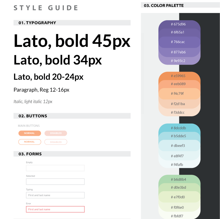
I developed a brand and style guide for my app. I opted for a playful and vibrant color palette for the logo while maintaining a structured appearance. After all this app deals with people’s finances and banking accounts, so it is crucial to strike a balance between being fun and trustworthy.
Design Decisions
Few things I kept in mind while creating my designs:
- Make sure to enhance the experience of managing finance
- Have a simple design leaving room only to features that a student would need
- I wanted to connect to the user age group by carefully creating a distinctive visual language that is memorable and stands out
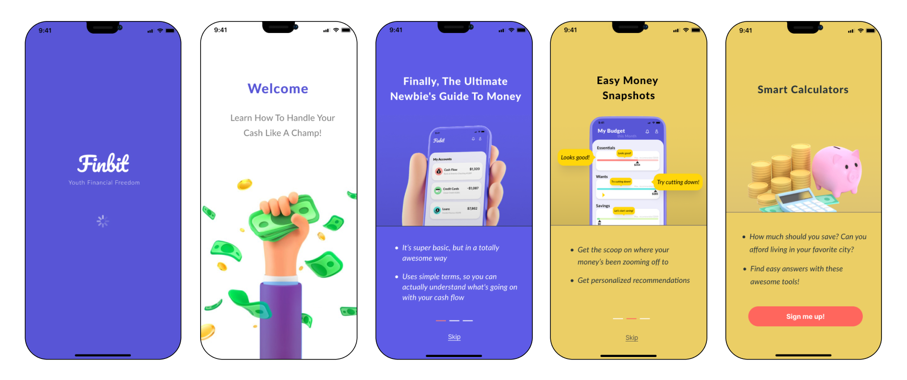
Vibrant colors: Our target mostly comprised of Generation Zers, who love energetic shades, contrasting and vibrant colors
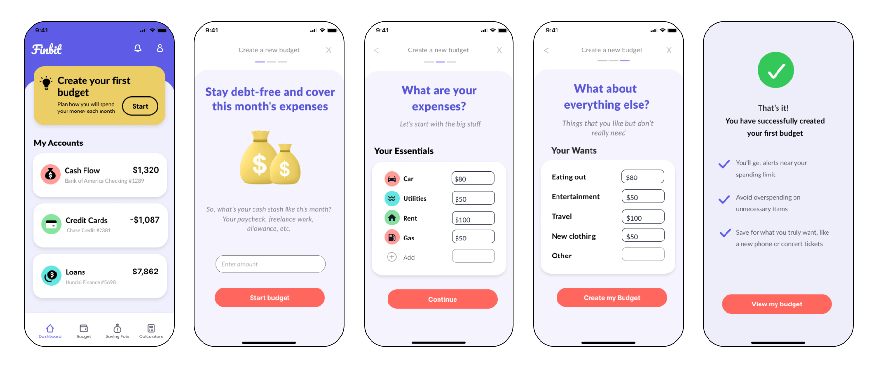
Minimalistic design: Users’ attention span is pretty short these days (around 8 seconds only), which makes minimalistic design even more crucial for mobile apps.
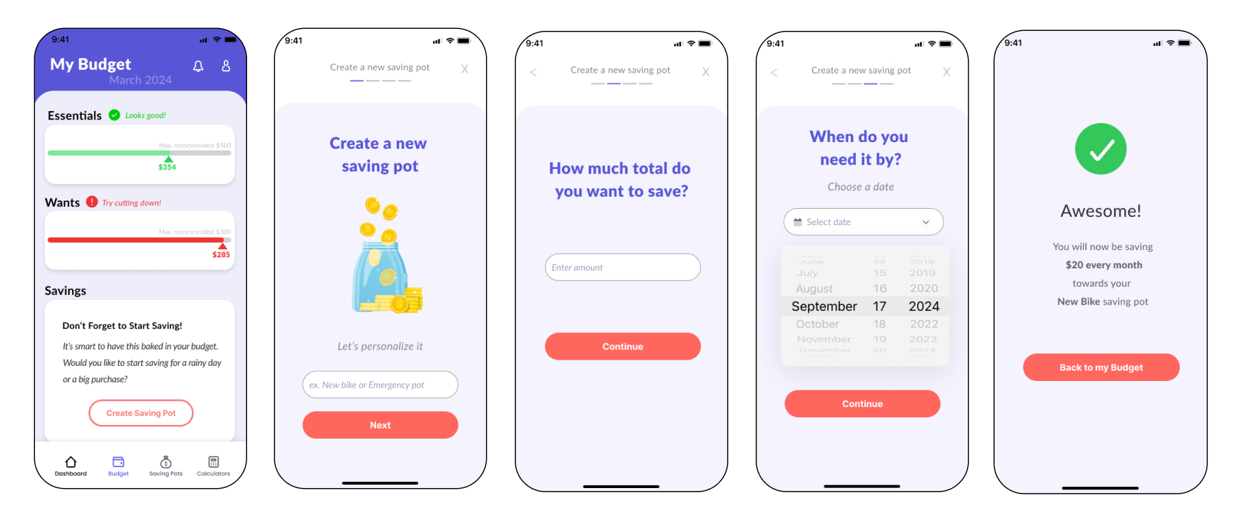
Hand-drawn illustrations: The style becomes an art trend this year. In an age dominated by technology, it reflects the desire to infuse a human touch into digital aesthetics.
Prototype & Test
High Fidelity Prototype
I created my high fidelity prototype and started conducting my testing. There were 4 participants who performed the moderated usability test. 4 separate tasks were instructed to them and their feedback were noted as well as kept recorded with the help of Zoom.
Key Findings and Iterations
- Participants were confused after connecting the first account, and saw the rest of the accounts connected.
Solution Idea: Make sure they understand what each section is, then connect them all in one click or one screen in the prototype version for retesting
- Participants weren’t clear about what to save for. Is it for a goal or is it for emergencies? The caption is explained but some did not read it, there were too many words.
Solution Idea: Simplify the Savings section to make it more readable.
- Participants did not immediately connect their accounts as a first step
Solution Idea: Call to action “start connecting accounts” needs to be more prominent.
Conclusion
It was incredibly rewarding to hear from my participants that they faced this problem and felt the solution I designed was a feature they hoped to see implemented in the future.
” Overall, it’s giving me a lot of comfort, it’s something that’s helping me manage spending “
” I like that it provides visuals [during onboarding] The process was easy and fun”
” This is really nice dashboard. It’s simple but in a good way, it’s eye catching “
