Web App Feature
Case Study
Orgmatch

How I helped design the onboarding of a gamified platform that matches corporate funders with non-profits
Overview
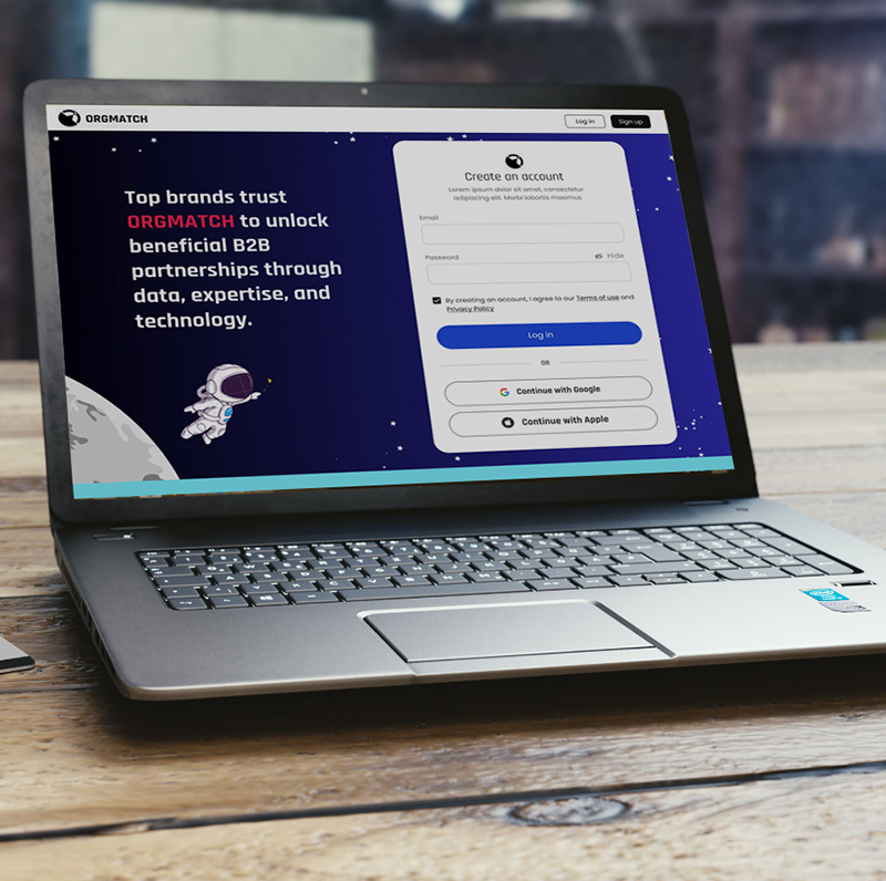
Orgmatch’s primary mission is to create ideal partnerships between corporations seeking to engage in philanthropy and nonprofits in search of funding. However, the company recognized that the setup process for these partnerships is often lengthy and demanding, with much of the funding being spent on administrative work. To address this, Orgmatch developed a cutting-edge AI platform that automates and simplifies the process of finding and establishing partnerships.
PROBLEM STATEMENT
The biggest challenge of the company’s existing platform was onboarding. The initial flow was lengthy and daunting, undermining the company’s main selling point of simplifying the partnership process.
How might we improve the way users are prompted for setting up their interactions with the web app by making the onboarding more engaging?
How might we simplify the onboarding process while ensuring a successful partnership?
Solution
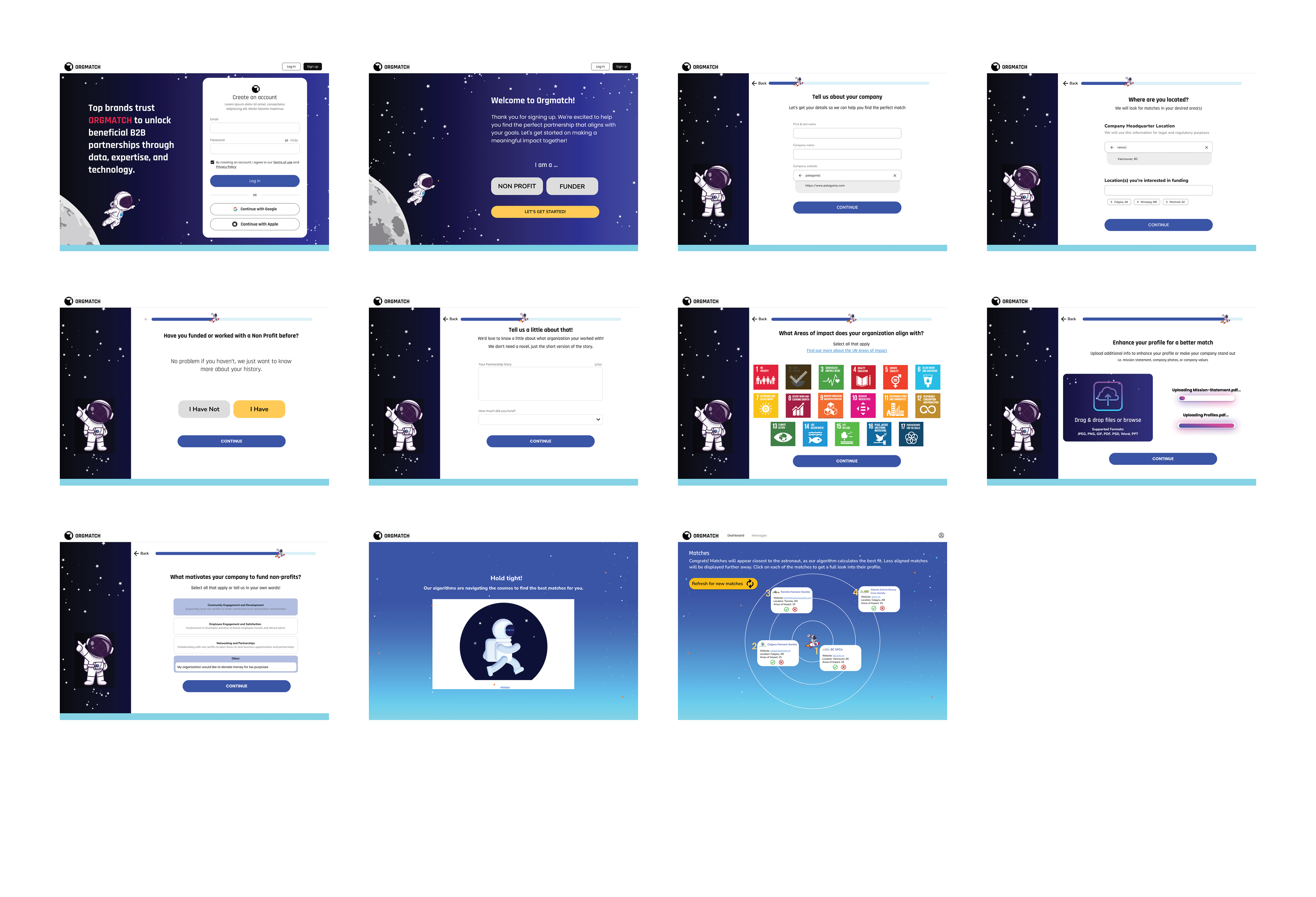
Orgmatch wanted to create a more engaging user experience by transforming it into a simpler, more enjoyable, and streamlined process. They envisioned a quick and gamified setup that guides users to be matched with a non-profit within minutes.
Team
Sandy Bouserhal
Parker Mckinder
Bailey Rhee
My Role
- Conducted competitive research
- Created user flows
- Designed mid-fidelity and high fidelity wireframes
- Followed brand guidelines
- Constructed a web app prototype
- Performed user testing
Timeline
4 weeks
Tools
Figma
Photoshop
Canva
Riipen
Google Docs
DESIGN Process
Research & Analysis
User Interviews
Competitive Analysis
Heuristic Analysis
Ideate & Design
User Flows
Sketching
Wireframes
Prototype & Test
Prototype
Usability Testing
Iterations &
re-testing
Research & Insights

Competitive Analysis
Nielsen’s UX Principles
1. Visibibity of System Status
Hinge, Bumble and Airtable all have some sort of visible tracking system to their onboarding to let users know how far they are in the onboarding process.

2. Aesthetic & Minimalist Design
Since Orgmatch has a rather shallow site design not needing many pages to get to any section, a minimalist design will be very effective.

3. Flexibility & Efficiency of Use
- Filter system is simplified
- Only 4 filters to select from
- Selecting causes is easy: expressions used are known and easy to understand
- Matching page displayed with photography
- Option to edit filters right away
- Notice the progress bar, and the limited amount of items to select
- Option to include a map
- Remind of the benefits of the program

Heuristic Analysis
Nielsen’s UX Principles
1. Recognition rather than recall
Minimize the user’s memory load by making objects, actions, and options visible. The user should not have to remember information from one part of the dialogue to another. Instructions for use of the system should be visible or easily retrievable whenever appropriate.
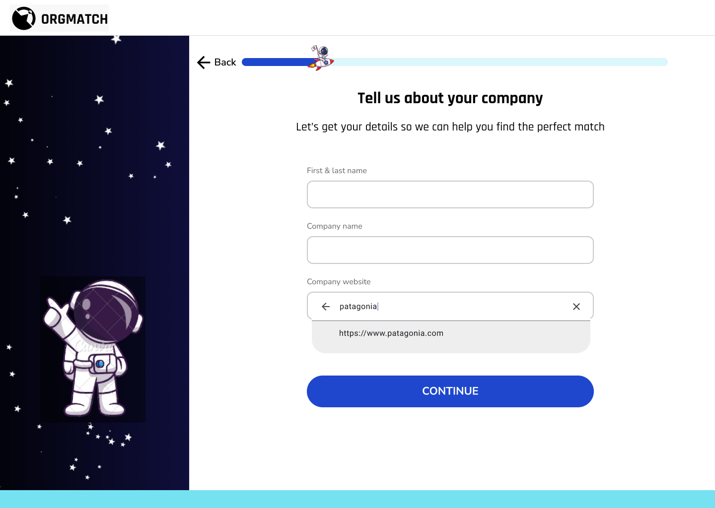
→ User should be able to type in, then a suggestion comes up
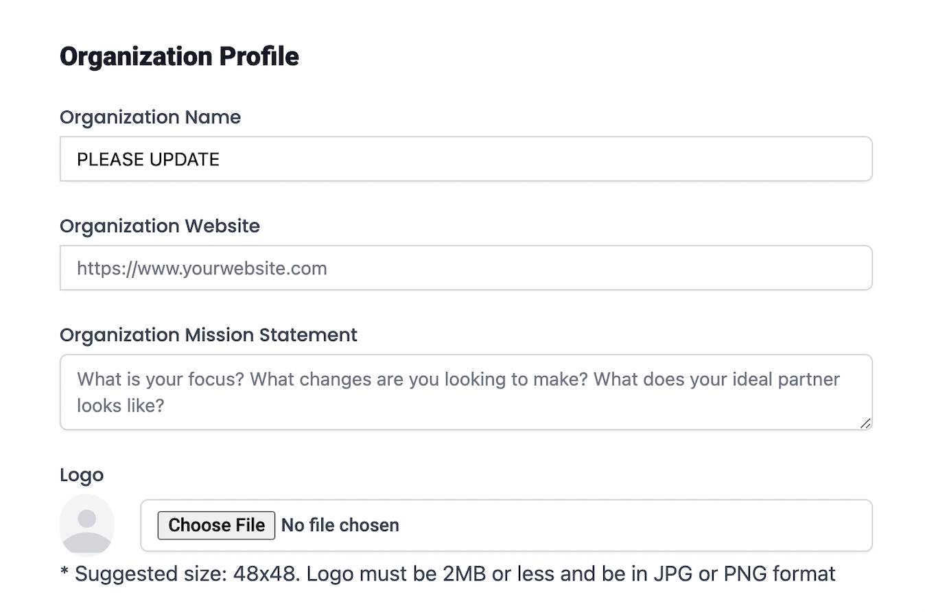
2. Aesthetic and minimalist design
Dialogues should not contain information which is irrelevant or rarely needed. Every extra unit of information in a dialogue competes with the relevant units of information and diminishes their relative visibility.
→ Achieved by reducing the cognitive load: break into simpler, smaller steps
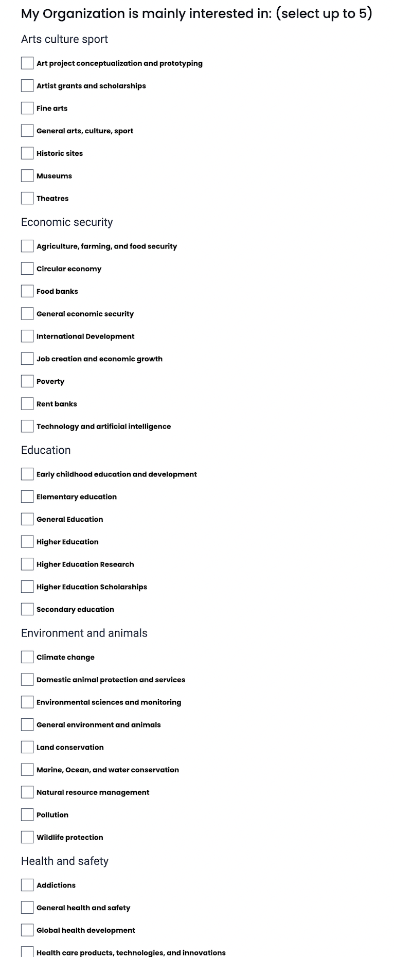
3. Error prevention
Even better than good error messages is a careful design which prevents a problem from occurring in the first place. Either eliminate error-prone conditions or check for them and present users with a confirmation option before they commit to the action.
→ Shows error only after submitting
→ Allows for more selections than the maximum

4. Consistency and standards
Users should not have to wonder whether different words, situations, or actions mean the same thing. Follow platform conventions.
→ Inconsistent colors in editing section

MVP and User Feedback
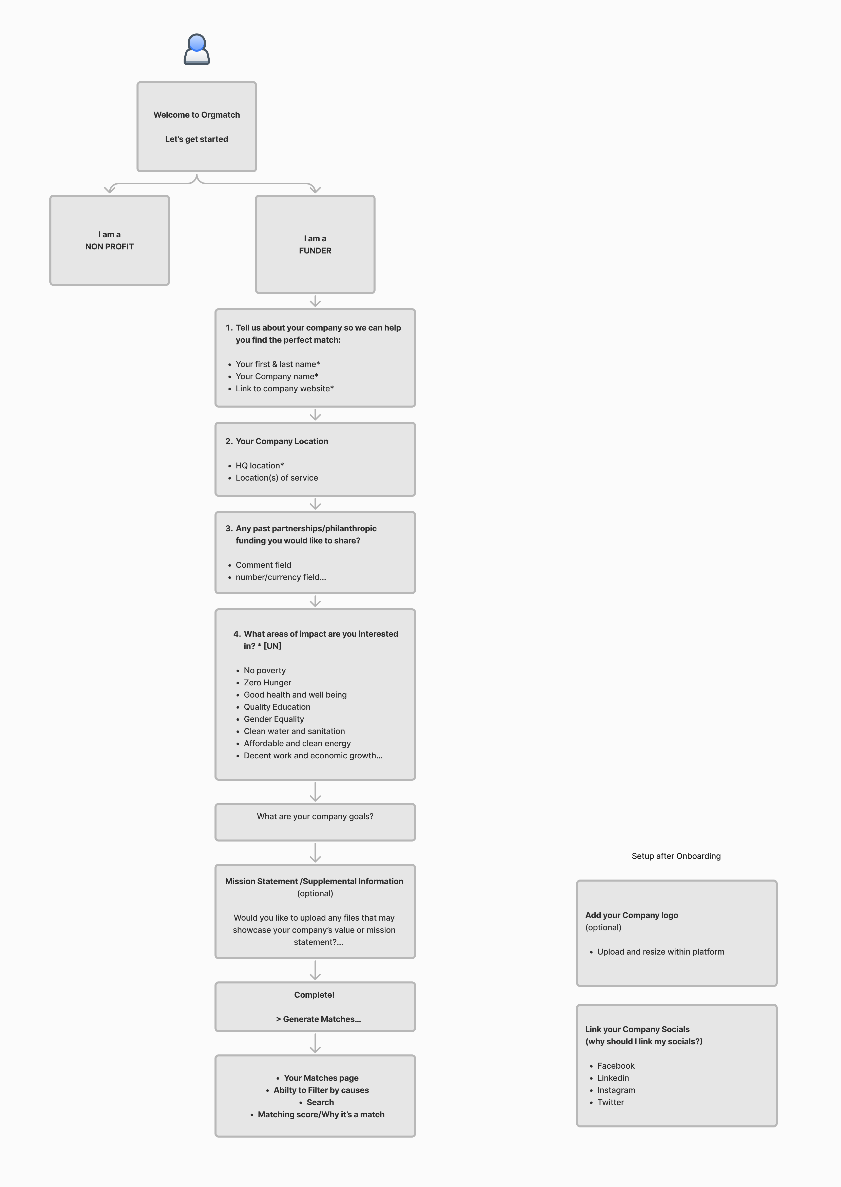
The client provided us with an already established MVP (minimum viable product) and user feedback. It quickly became apparent that the MVP had significant flaws. The onboarding flow was identical for both the funder and the nonprofit, resulting in a lengthy process since different questions were directed at each, yet combined into a single flow.
Key User Insights:
After analyzing the provided feedback from the users, I summarized them into 3 categories:
Frustrations:
- Unknown how things are organized
- Unknown terms used
- Overwhelmed with too many options to choose from
- Having some fields as optional is good, users do not always have the answer to certain questions
- Many irrelevant questions
- Major friction in certain field areas such as finding location
What they thought was missing:
- Option to upload strategy/ media files to profile: “How do you know how we work and what we really want to achieve?”
- Ask about the funder goal: “We never state our goal, how can we start a search?”
- Geography/location: “We have offices around the world, I need to see who is close to each office, not just our HQ”
Areas for improvement:
- Simplification and combining questions is a major point of focus in user feedback
- Improve readability
User Flows & Wireframe Sketches
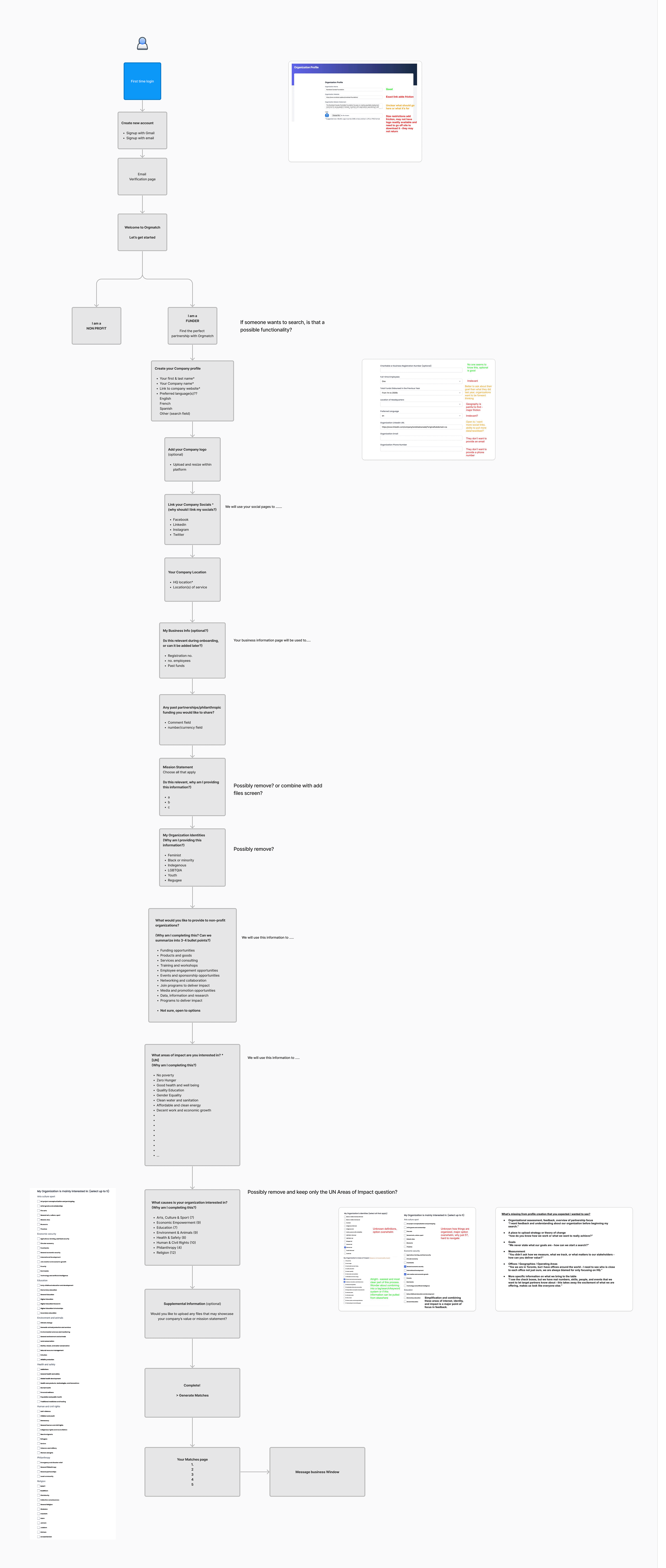
One of the biggest challenges my teammates and I faced was reducing the amount of information asked from the user while still ensuring an effective onboarding process with enough details to find a unique partnership. I suggested finding the most crucial information needed from the user to ensure a relevant match. I constantly reminded our client and my team that onboarding is the most critical part of the process—we cannot bore the user and risk them abandoning it halfway through.
We repeatedly revisited the user flow and wireframes, refining the content to focus solely on what was essential for the onboarding process before moving on to the higher-fidelity prototype.
Existing user flow
Re-designed user flow
Design & Testing
Since the client had an established brand, we began by collecting the branding guide elements to get started on the visual design, ensuring consistency with the overall feel of their brand.
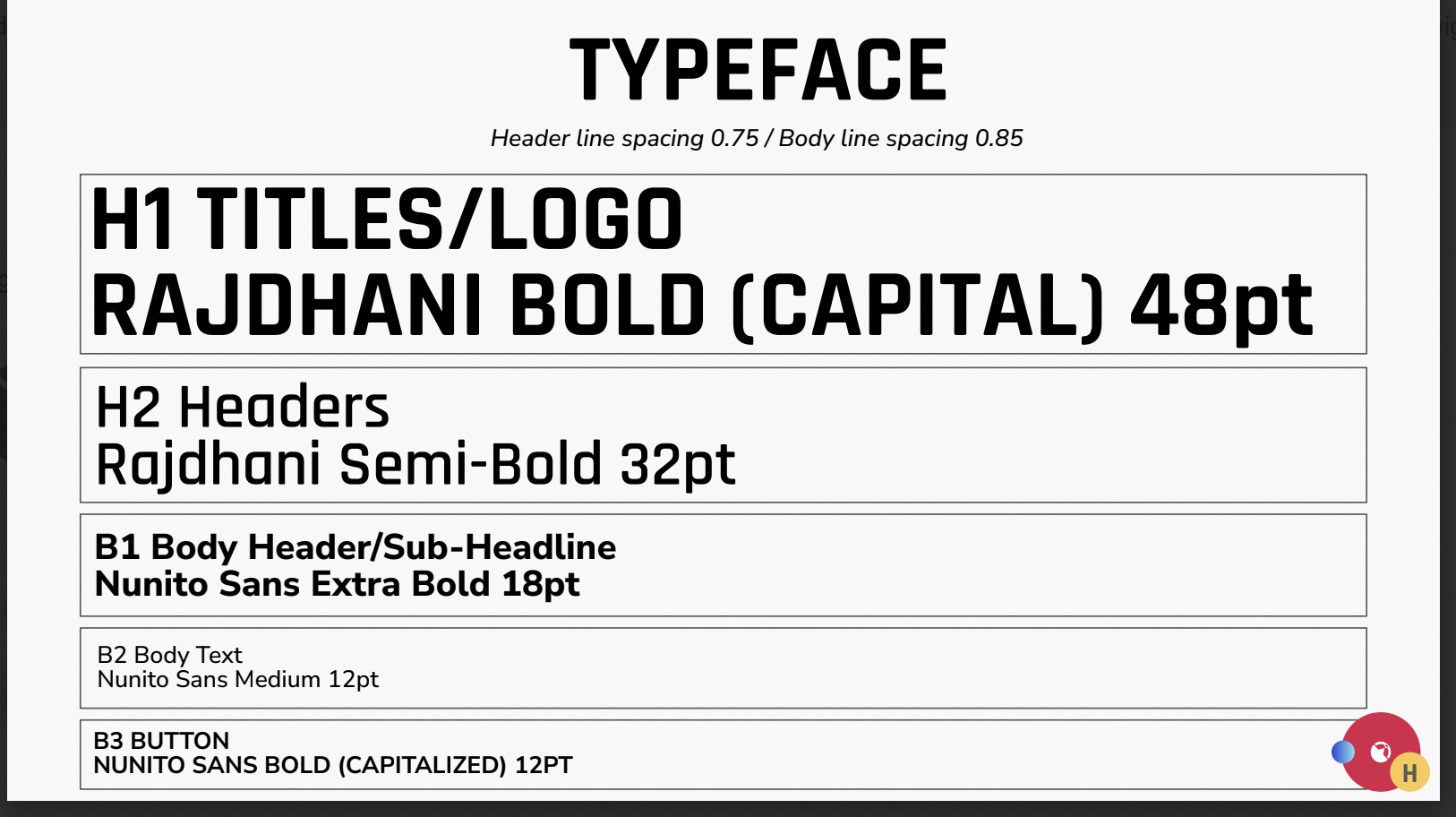
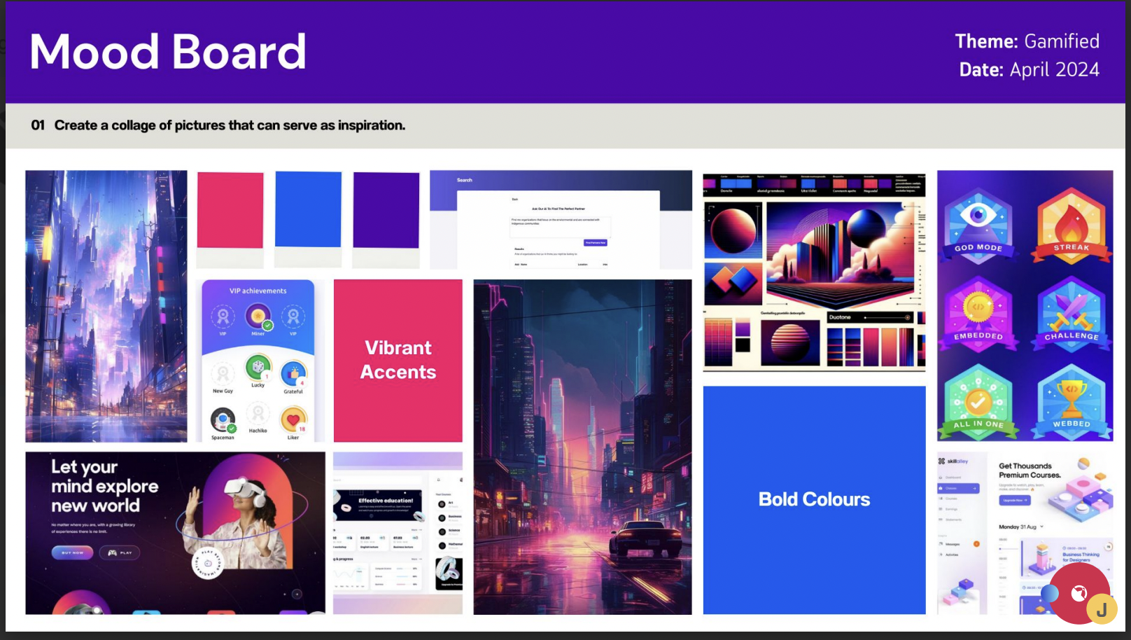
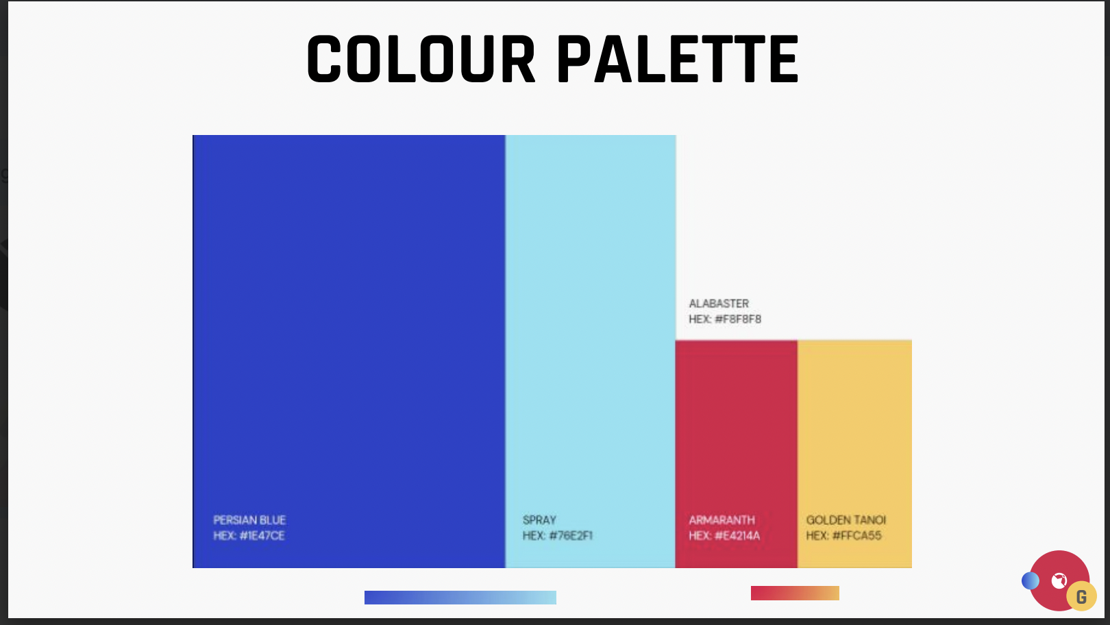
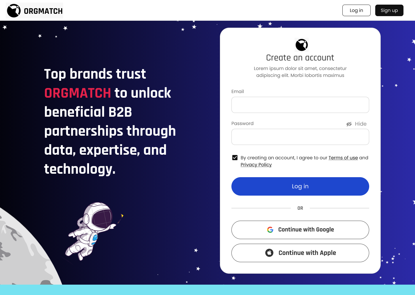
One of the main ideas that the client wanted to implement was gamification. The goal was to make this process more engaging by making it more fun and entertaining with a mascot guiding the user throughout the process. The mascot would have tips and feedback displayed to help the user while going through the onboarding.
Usability Test Insights:
We conducted a round of usability testing with 4 users. There were clearly less severe issues than the user feedback provided by the client on their MVP. The main issues that came up were:
-
-
-
- Add a screen at the beginning that clearly states what Orgmatch has to offer, before onboarding
- Clarify the questions: Users want to know how the information that is being asked is relevant, how will it be used for the match?
- Use of autofill whenever possible
- One of the users mentioned “investing” makes them feel like they’re getting something in return. Use the word “funding” instead
- Clarify the location page : Why asking about the headquarters? Is it the location of the company or just location in general?
- Do not ask to provide specific numbers “Will never give numbers, too intimidating”
- Use a drop down list with a range of numbers instead
- Do not ask open ended questions: user doesn’t want to write a story during an onboarding
- Do not give too many choices to answer. Can be lumped into 3-4 choices
- Users would like the opportunity to upload and share company pictures with the community
-
-
Reflections & Next Steps
Start Testing Early
Start testing design ideas early on, including what the client asks for. It’s important to keep testing at every stage of the project. Looking back, it would have been helpful to even test the gamification feature the client wanted. It’s crucial to understand how investors feel about using game-like features in serious financial situations, like investing in nonprofits that fight hunger. This understanding builds trust and makes adoption more likely.
Keep Testing
Due to time constraints, our guerrilla testing helped address significant issues in the onboarding flow. To further improve, I would conduct moderated usability testing with real potential users. This will provide more precise feedback and enhance trust in the app.
CONTACT
If you have a project in mind, need design expertise, or just want to chat about all things UI/UX, feel free to reach out!
