Cooking App Feature
Case Study
Savr
How I ran a design sprint and created a feature aimed at enhancing the cooking experience
Overview
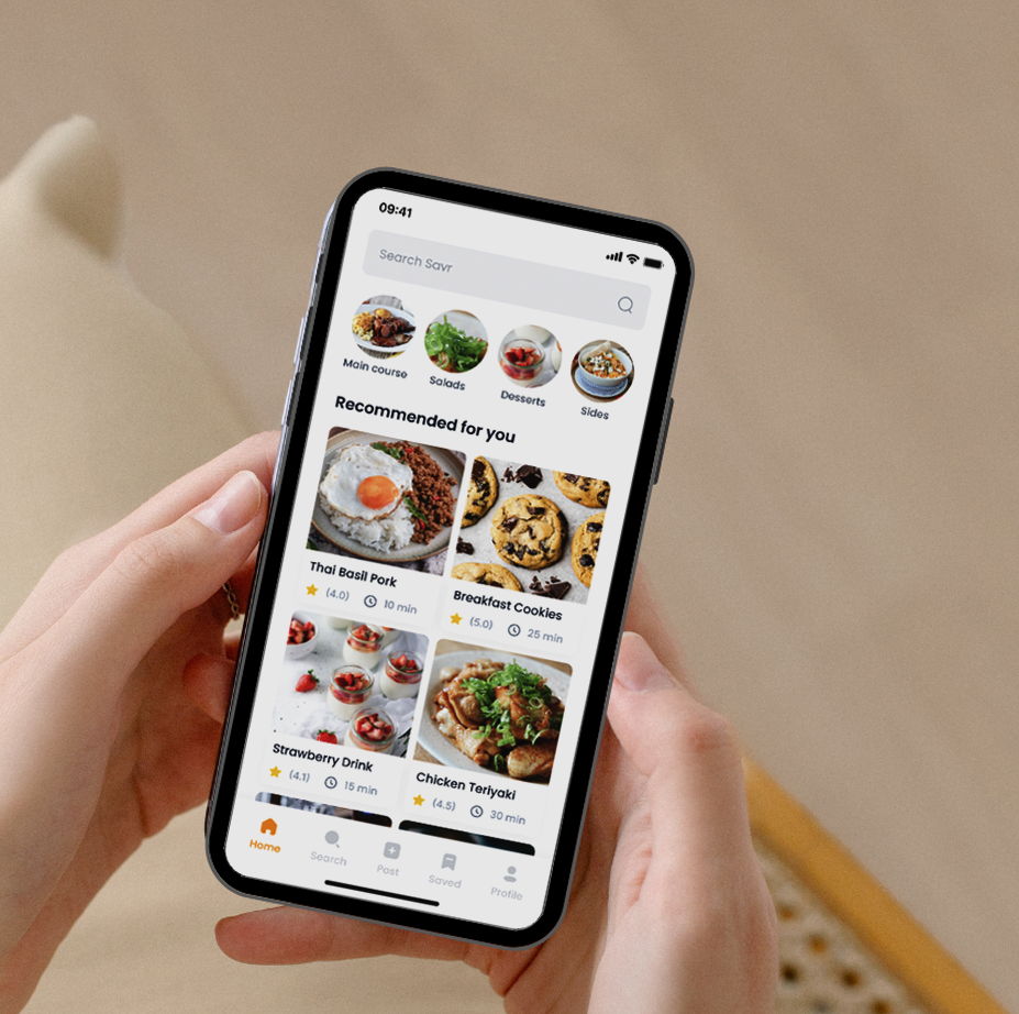
Savr is an app that offers a collection of recipes and a community of home chefs.
I worked on this project using a modified version of the GV design sprint methodology. This process took 5 days and allowed me to quickly determine if I want to go through with the designing and building of a particular feature in the cooking app, Savr.
Problem Statement
While users love the quality and variety of the recipes, many struggle with following and successfully executing them. This challenge has led to a decline in user interest in the app
Solution
I ran a five-day design sprint and eventually created a feature aimed at enhancing the cooking experience for these favorite recipes. This will help sustain user interest in the app over time
My Role
Research Analysis
Ideation & Sketching
Storyboarding
Wireframing
High Fidelity Prototyping
User Testing
Tools
Figma
Photoshop
Canva
Riipen
Google Docs
Day 1
Understanding the Problem
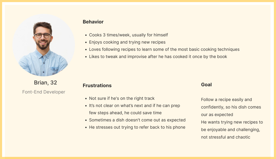
I started by reviewing the research highlights and interviews provided. I organized my observations to help me understand the users and their needs. I then created a persona to help focus my strategy on a manageable and memorable cast of characters to design for.
HMW Questions
Based on my research analysis, I developed a series of HMW questions to help me reflect on possible solutions
How might we make the experience of cooking recipes more enjoyable?
How might we ensure that the user follows a recipe easily and confidently?
How might we help the user save time and avoid mistakes?
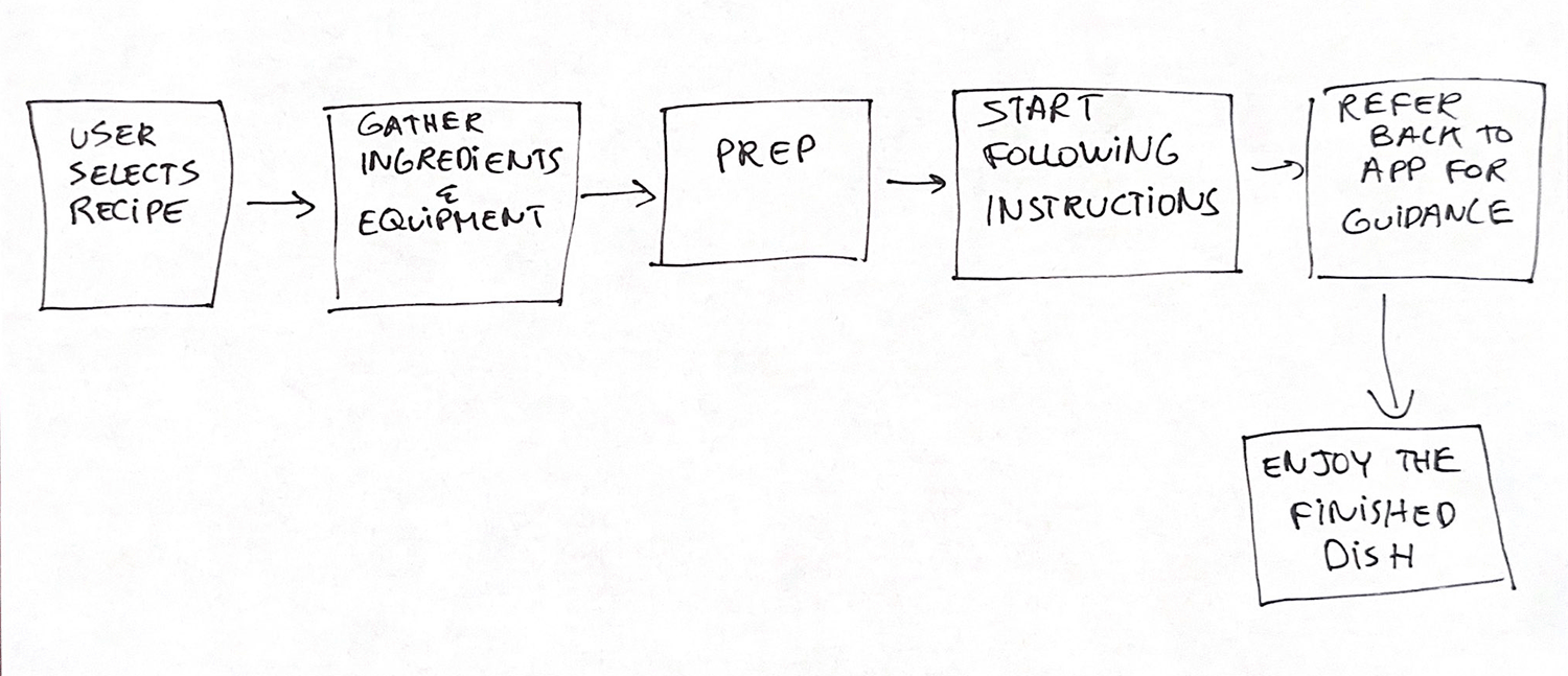
What is the end-to-end user experience?
In order to identify a possible path a user may take to achieve their goal, I sketched a map to define my user journey
Day 2
Ideation and Sketching Solution
Inspiration
I began exploring products that address a similar problem to find inspiration. It appears that each app emphasizes a different aspect of the recipe-cooking process. For instance, some prioritize the search for the perfect recipe, while others focus on providing a seamless experience during the cooking process itself.
Tasty

Fun and colorful videos, users can see what their meal should look like every step of the way, along with a written explanation
Mealtime
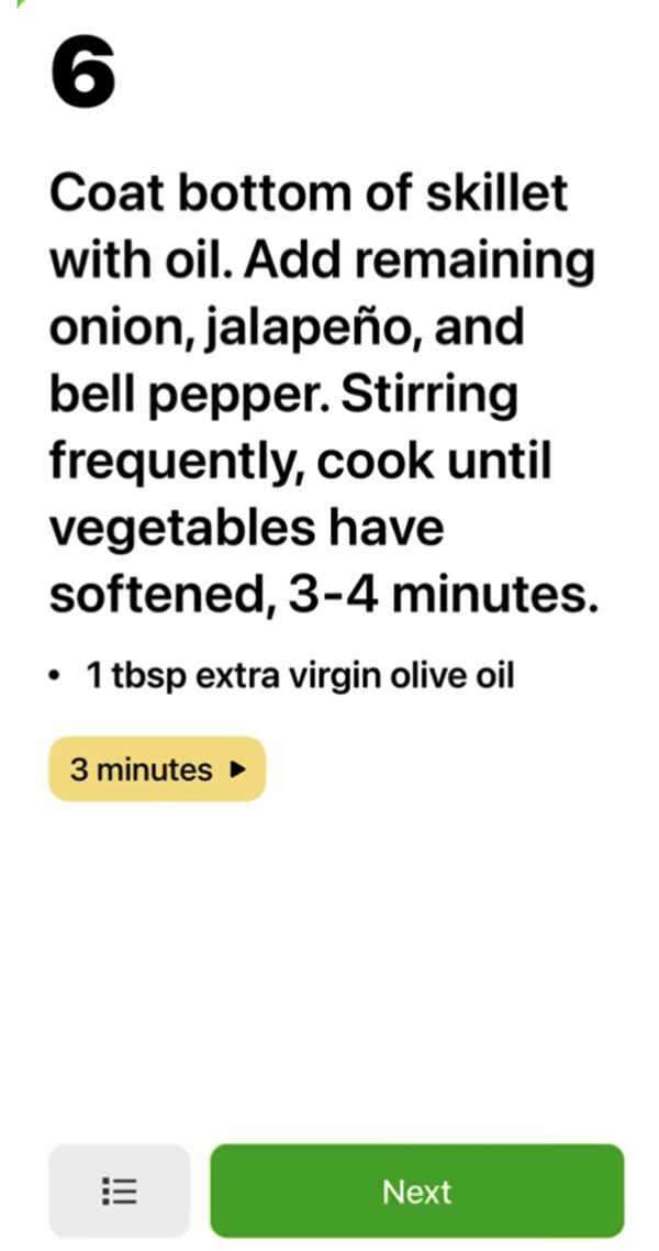
Each recipe tells users how much time it should take
Kitchen Stories
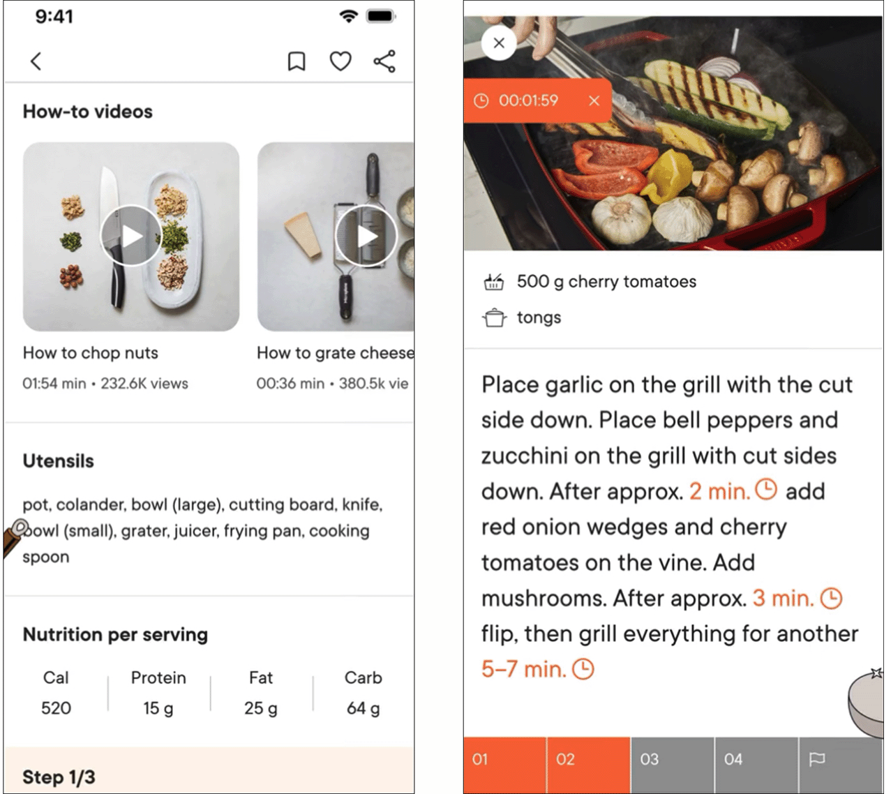
Practical video instructions
Each recipe comes with a step-by-step photo guide
Lightning Demos & Crazy 8s
The primary goal of this design sprint is to elevate the cooking experience, with a particular emphasis on following instructions while preparing recipes. I’ve chosen to concentrate on this specific flow of the end-to-end experience and started sketching different variations and ideas of this screen using the crazy 8s method.
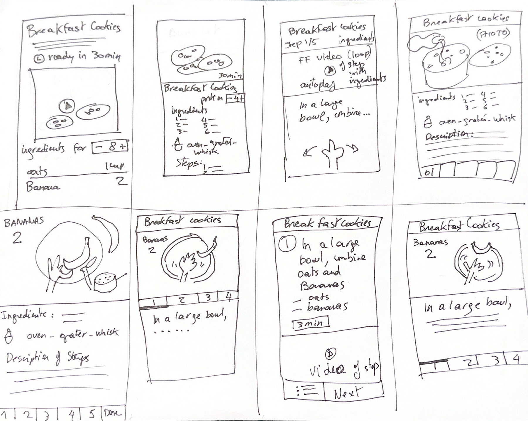
Sketch of design variations of primary screen
Proposed Solution
I then chose to elaborate on the second screen, as it presents the solutions to the user’s frustrations in a neatly organized layout. I developed the screens before and after it to analyze the flow of this particular task.
I then chose to elaborate on the second screen, as it presents the solutions to the user’s frustrations in a neatly organized layout. I developed the screens before and after it to analyze the flow of this particular task.
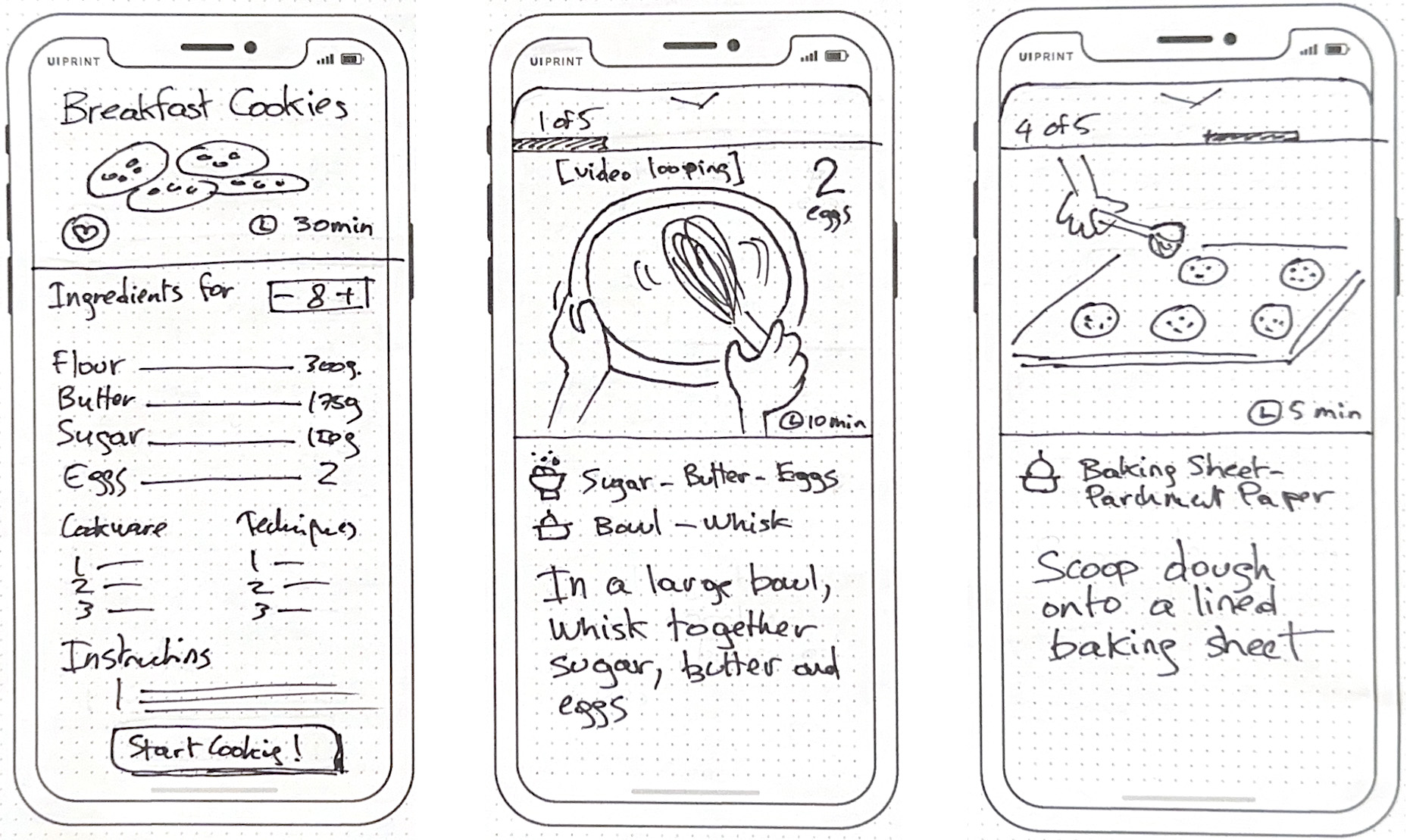
Three-step sketch of the solution flow
Day 3
Decision and Storyboard
Refining My Solution
Looking back on my solo sprint, I refined my design solution and sketched out the user experience with more thorough storyboarding. This approach encouraged me to consider additional details before moving on to constructing my prototype for user testing. I went back to my personas, their actions, and pain points, shaping my design decisions around these observations.
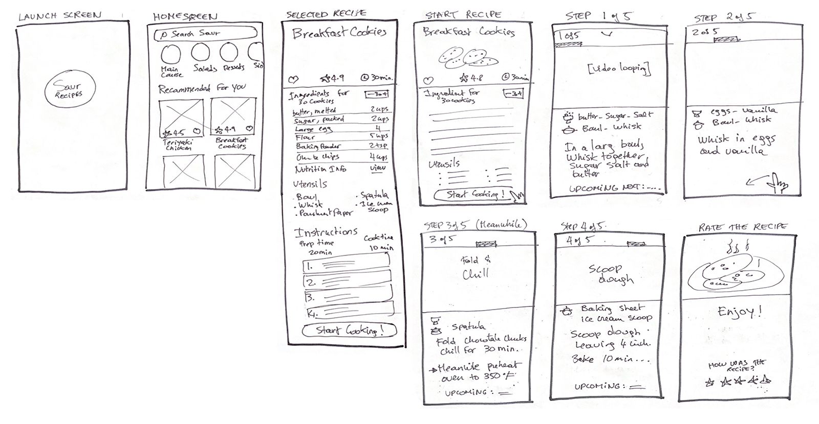
Storyboard of solution screens, prior to constructing interactive prototype
Day 4
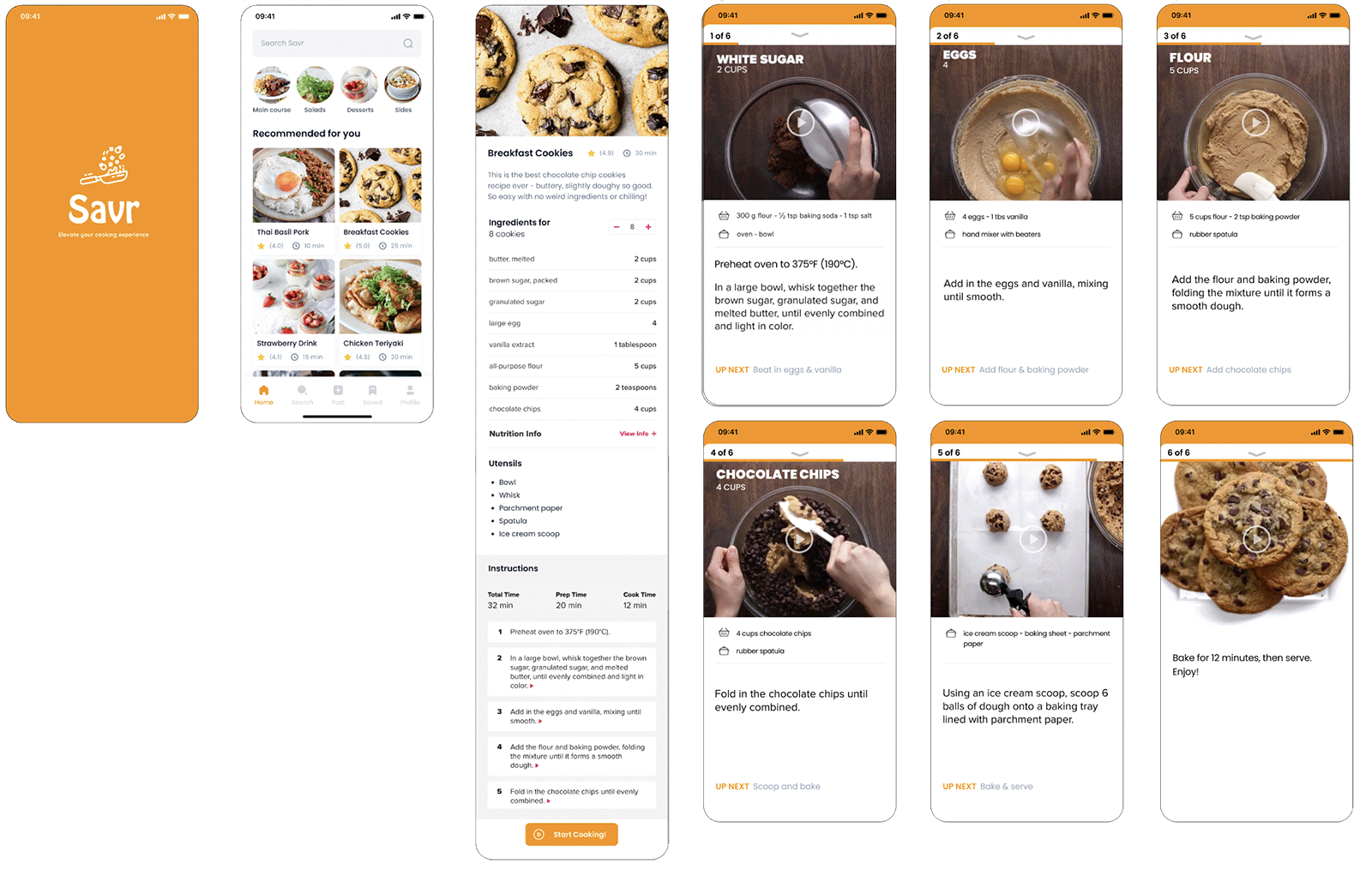
Interactive Prototype
Key features I included in my prototype:
-
- Option to save recipes for future use
- Preparation steps before hand
- “Upcoming steps” give a preview of next instructions, and help gather the next ingredients to optimize time during waiting periods in recipes
- Brief looping videos illustrating each step, eliminating the need for pausing or rewinding
- Videos demonstrate both the visual and techniques: no need to interrupt cooking to research unfamiliar techniques
- Visuals help to keep track of the progression and minimize errors
Day 5
User Testing
In-person interviews and testing
I conducted in-person interviews with five users and took detailed notes. These users typically cook 2-3 times a week, or occasionally to learn new recipes. It appeared to me that cooking method preferences vary greatly among individuals. Some resist watching videos, while others prefer to jump straight to the video-recorded version of the recipe.
Users generally found the process easy. Some of them preferred to follow the recipe by reading the listed instructions, and others clicked through to watch the step-by-step videos instructions. They found that looping videos are useful as they do not need to pause and repeat every time. They also like to read the instructions while the video is looping, so they’re not missing anything. They appreciated the Next step as it gives them an idea on what ingredients are coming up next.
“I like that I don’t have to use the video, I can also read the instructions”
“Very helpful to have the ingredients for each step”
“I like how it shows it to you in a moving instructions”
“I like that it’s in order, I wouldn’t skip steps accidentally”
“It’s nice that the video is only for the specific step, I don’t have to pause myself”
“The Up Next is nice – I can prep for the next step”
Key findings:
1. It is not necessary to have the portions repeated both in the video and listed underneath.
2. Listing the utensils during the step-by-step is redundant, users didn’t find it useful
3. It was mentioned that specifying if the recipe is gluten free or peanut free would have been helpful
CONTACT
If you have a project in mind, need design expertise, or just want to chat about all things UI/UX, feel free to reach out!
